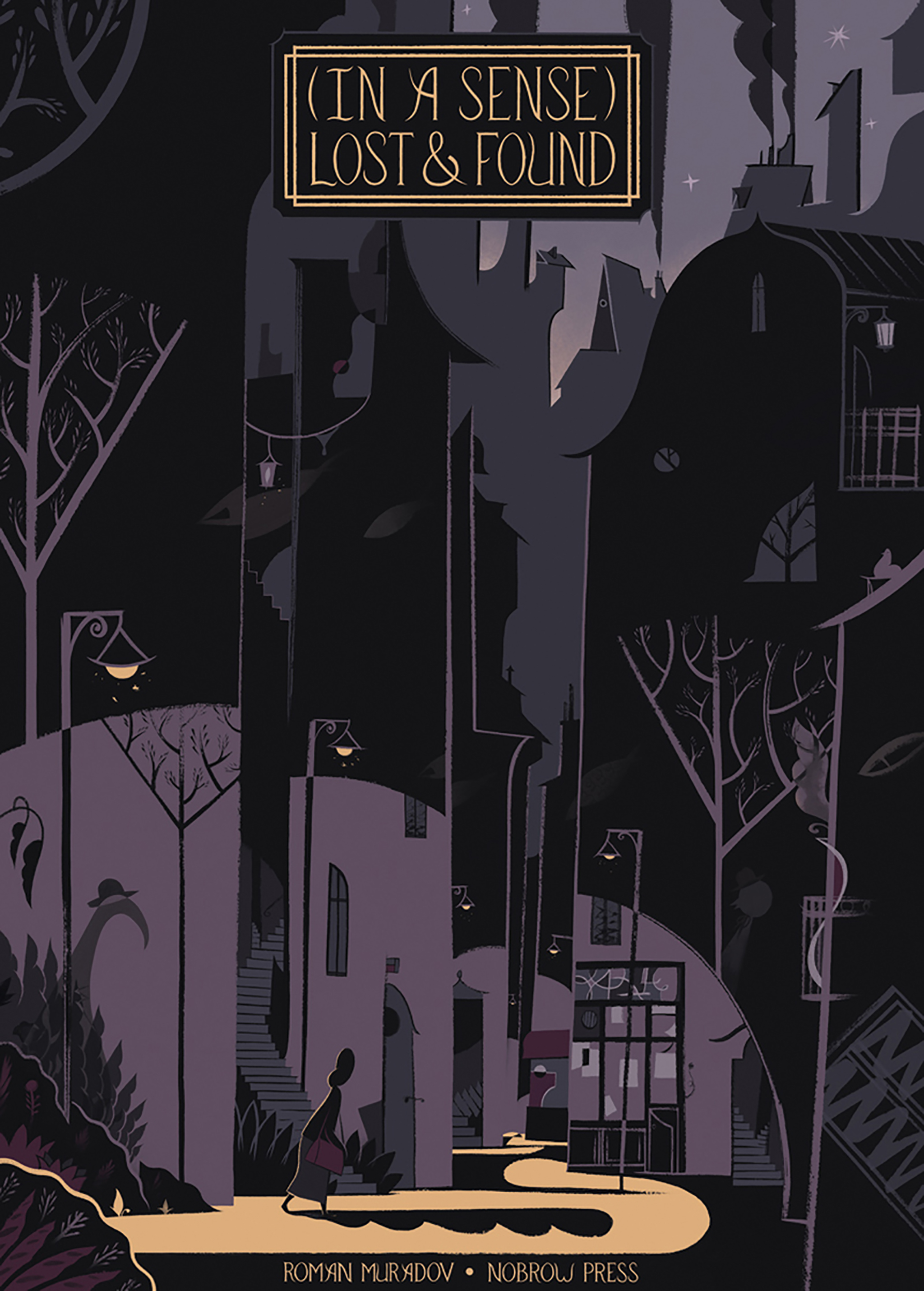
Roman Muradov is an artist whose work we’ve admired from afar for several years. He is a prolific illustrator with his work cropping up far and wide, from the cover for James Joyce’s centennial edition of Dubliners, published by Penguin, to working with highly esteemed publications such as the New York Times, The Wall Street Journal and Vogue. His style is utterly spell-binding and his imagination singular. With each illustration, he creates a new impression of the world and its characters emerge with a freshness and vibrancy that are simply enchanting. In 2013, Muradov received a gold medal from the Society of Illustrators. (In A Sense) Lost and Found is Roman’s first book with Nobrow. Despite being in high demand, Roman kindly agreed to answer a couple of our questions to get us that little bit closer to the man behind the art. Here you go…
What inspires your work?
I’ve been influenced by Saul Steinberg, James Joyce, Tove Jansson, Armando Iannucci, Vladimir Nabokov and many other writers, artists, comedians and musicians. I’m fascinated by the language and logic of dreams and I’m entirely indifferent to their interpretation. My creative process is that of simultaneous deciphering and encryption, an attempt to approximate the midpoint of a dream’s move towards wakefulness, in which the mind invariably fails to re-create the dream. I have something of a soft spot for futility, repetition and repetition.
I started speaking English fairly late, which may explain my propensity for puns, mishearings and ambiguities, although as narrative tools they translate into visuals just as well.
I’m also an obsessive walker and I like to spend half of the day walking alone with no destination or purpose, letting the memories of previous walks layer themselves into a dreamlike drift. Pleasant weather and silly car numbers move me more than anything.
Tell us a bit about your process….
Usually there’s an image or a phrase, almost a manufactured memory–it amuses and bothers me in a way I can’t understand, so I pose it as a question and question it further until the possibility of an answer becomes irrelevant. That said, I try to keep my stories humorous and pleasant to the eye even in their most obscure and bleak moments.
I’ve always admired the playful spirit of Oulipian writers like Georges Perec and Raymond Queneau, so I come up with constraints of varying complexity to escape the trappings of inspiration (or boredom) and to delude myself that I’m solving a puzzle rather than working. I’m very particular about keeping my references in full view. Most obviously (In A Sense) owes its plus-fours and premise to Hergé and Kafka, as I make clear on the very first page.
My approach to drawing is a balancing act between accident and design–to preserve spontaneity I spend far more time planning and editing, than actually drawing. Nowadays I use a lightbox, which allows me to try several things out over a sketch, but (In A Sense) was drawn traditionally over pencils, which is why quite a few pages had to be redrawn from scratch 4-5 times: the total stack of original pages is about 3-4 times thicker than the actual book. Coloring and editing took preposterous amounts of time as well, but I’m dedicated enough to spend hours and days on a single page searching for the right combination of tones that will work together just right. Ideally I want my drawings to read as part of the writing, a sort of visual equivalent of indirect discourse.